Responsive Spacing with Chakra UI
By James Akpan
Chakra UI is a React based user interface library. Basically it helps you build more user friendly interfaces while still opting for optimal functionality. The creators of Chakra UI put in a lot of work to ensure that components built with it can be made as responsive as possible.
In this article we will be exploring how to make responsive elements and components. We all agree that the right spacing makes user interfaces easier to navigate, and also tender to the eyes.
Chakra UI makes it easy to add spacing to our components. When creating components with Flex / Grid we are given the option of adding a gap attribute. This attribute typically expects a number value — ie {4} — or a string — ie 4rem — and also an object, which we will see in the code sample below.
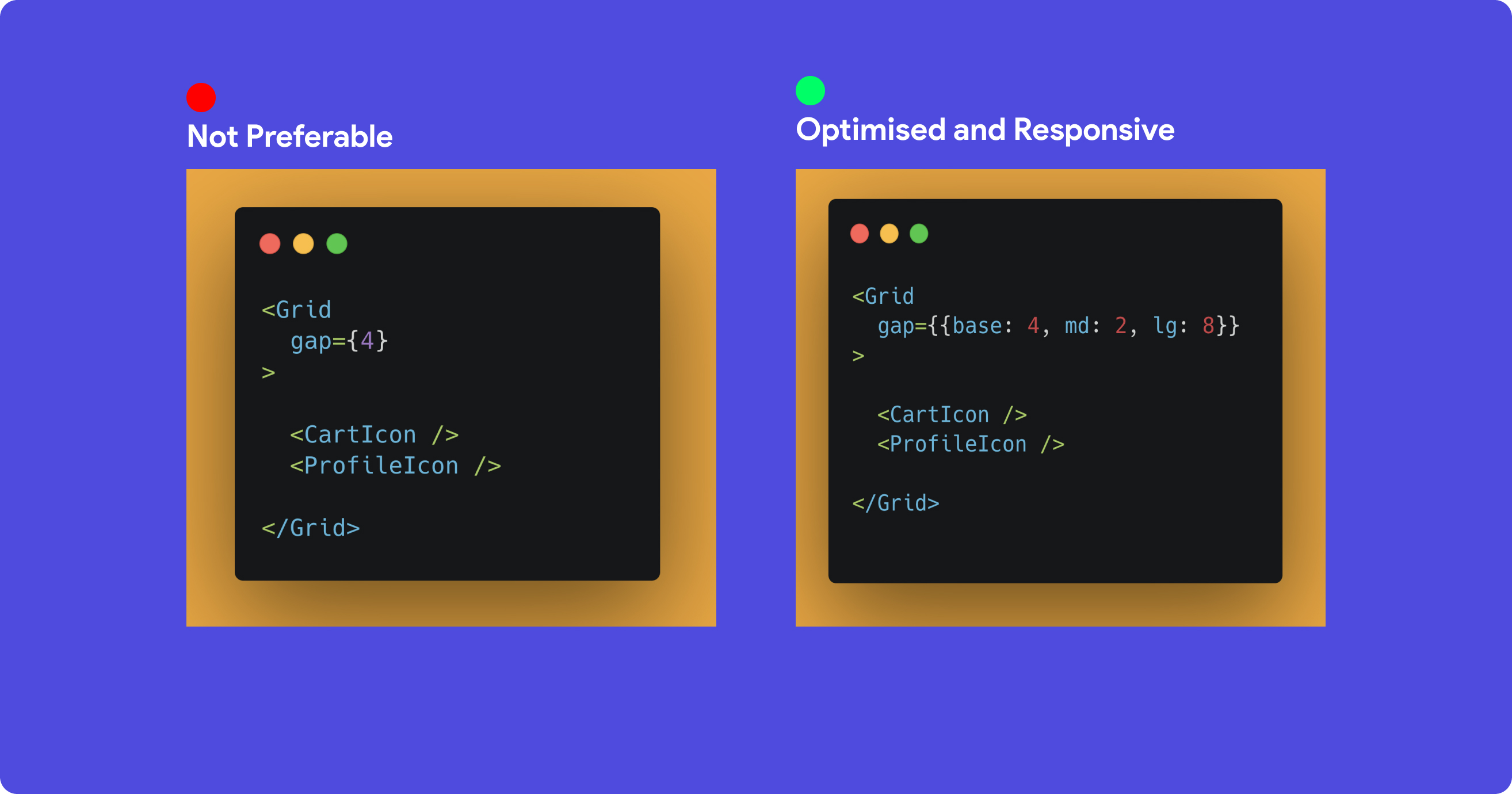
On the left image we have passed in a single value for the gap attribute. This works, but it isn't optimal and doesn't give us the opportunity to make our components as responsive as we want.
On the right, we're introduced to a more optimal way of adding spacing to our component. The gap attribute accepts an object whose keys represent breakpoints, and whose values represent the spacing at each one:
lg— screens not larger than60em(default:992px). MacBook Pros, laptops.md— screens not larger than48em(default:768px). Tablets, iPads.base— the default for all screens if we do not specify others.
Read the full documentation of how Chakra UI specifies their spacing here.
One more interesting thing: this principle can also be applied to fontSizes, colors, and the display toggle.
I hope you found this article helpful in some way. Enjoy the rest of your day.